


 There's no fate but what we make for ourselves.
The process of putting together an issue of THRICE Fiction seems simple... the editor hands you a stack of stories, you paste them into a document, you add some pictures, and BLAM! a magazine is born.
Except it's nowhere near that straightforward. And most of that is my own fault.
When R.W. and I first began discussing how THRICE was going to work, I had a very clear direction I wanted for the design of it all...
Of course, had I known three years ago what I know now... I probably would have done things differently. A lot differently. I'd hack stories apart, add art only if I could find it, and just cram stuff in any which way. It would have made my life much easier going forward.
But then THRICE Fiction wouldn't be THRICE Fiction, so I guess everything happened as it was meant to all along.
Which brings us to Issue. No. 9...

Download the issue for FREE by visiting the THRICE Fiction website!
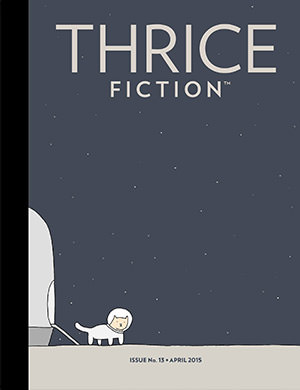
As always, the cover was a struggle. Originally I had done painting for it, but I had already done the past three covers and really wanted something different this time. I was working on an alternative, but that didn't come together this time around, so I was back to my design again.
Until...
I remembered an incredibly talented artist named Katelin Kinney that I was lining up for Issue. No. 10, and decided to throw a Hail Mary pass in her direction to see if she might have something available. Lucky for all of us, she was perfectly happy to let us borrow some works for her portfolio, and we ended up with this amazing cover to close out our third year. It's a photo art composite titled Seed of a Soul, and the reaction to it has been overwhelmingly favorable, so thanks, Katelin!
For a look at the first half of the art included in this issue, click onward to an extended entry...First, a warning. There be spoilers from here on out, so please go download a FREE copy of THRICE Fiction No. 9 before proceeding!

INSIDE FRONT COVER. I'm forever looking to open each issue in a way that snaps the reader awake and surprises them, so when I ran across L'appel du large after being contacted by French painter Francis Denis, it became my one and only choice to start the show. My only problem with the piece is going to be trying to figure out how I can top it in Issue No. 10!

Page 2 & 3. When I first got around to reading Andrew Hogan's Sleet, I couldn't quite understand where it was going. As I kept getting closer and closer to the end, I was becoming worried that it was going nowhere and had no clue what I was going to do with it. And then, of course, I actually got to the ending and was taken completely by surprise at just how insanely brilliant it was. Originally, I had positioned this right in the middle of the issue because I wanted to use it as a monkey wrench to shake things up. At the last minute, I decided to open the issue with it instead. When it came to the art, I was going to draw an undead creature very small in a cone of light in the bottom-left corner. Then I realized how insane it was for me to destroy the surprise ending for everybody else, so I went with something pulled directly from the story, but rendered it suitably ambiguous. Even though I've read Sleet almost a dozen times, I still laugh at the end every time.

Page 4. After Sleet I searched and searched for a story to bring us back down to earth. Rena Rossner's sweet Corner Store Love Story fit the bill perfectly. And when it came to the visuals, I was determined to capture the "spark" of first contact upon which everything is built. Now, if you've read the story, you will realize that Sarah hands Ezra a BOTTLE of Coke. So I tried Coke bottle after Coke bottle after Coke bottle in every conceivable way you could position two hands and a bottle... all to no avail. The bottle was just too tall for the space I had. So, rather than give up on the visual I thought the story really needed, I took some artistic license and put a can in there so that everything fits properly. Hopefully Rena can forgive me for it, but I really wanted to do justice to her story, and this was the best way I knew how. Oh... and this is the first of two places in this issue that I had a devil of a time forcing auto-correct to NOT capitalize "Coke." In some parts of the World (namely, the American South) "coke" is used as a generic term for "soda" or "pop"... and so I intended to leave it that way... even though I went with the iconic label of the image. Unfortunately, my software kept changing it, so I ended up uploading the story the wrong way, and had to re-upload a corrected version once I discovered what happened (and turned auto-correct OFF!). My apologies! The art is constructed from seven stock photos that have been cut, assembled, painted, then run through Photoshop.

Page 5. My original intent was to have Nina Kotyantz's poignant Is This the Promised End? at the end of the magazine (because, I know, right?). Ultimately I decided it would be a bit of a down-note to end things on, so I reconsidered. For the art, I didn't want to step on any of the beautifully-descriptive prose, so I just had a crown sitting on the pavement in the rain. It looked like such a half-hearted effort that I came back to it as I was wrapping up and started over from scratch, this time having a page of King Lear next to it. The paper is old so the rain drops splashed on it look a little like blood. I was going to mute them a bit but, if you've read Lear, then you know it's actually more appropriate to have the raindrops looking like blood, so I left them that way. This is all stock photos assembled for Photoshop filters. I had done some painting on it, but the details on the crown and paper were lost, so I got rid of it.

Page 8. And here it is... that one story that comes along each issue that I struggle and struggle and struggle to get right! Vica Miller's Charlie's Angel was the first piece I read for this issue, and I wanted it all to myself. It was beautiful and touching and sweet and just "stuck" with me for the longest time. But what to DO with it? I went through several revisions of an abstract angel encompassing two small figures of father and son. I liked the direction very much, and kept working and working to get the look I wanted. Once I got there, I moved on to the next story. As I was waiting for the rest of the art to come in, I re-read the story and decided I got the image all wrong. The piece wraps up so nicely with "'She'd like that,' answered Charles"... and I decided that the opening art needed to reflect that. So I took one of Veronica's red flowers and had her hands coming down from heaven around it... she's an angel, after all. The art is a collage of five separate photos that's been painted over a bit, then run through Photoshop.

Page 10. Whenever I'm stuck for ideas on a story, I send it to Chad knowing that his imagination will know exactly what to do. And the result for Mia Avramut's Vodka and a doctor's prayer speaks for itself. When this image landed on my desktop, it made me wish I could give Chad two month's salary so he could take a leave of absence from work and have an entire issue of THRICE all to himself. Bonus points to any Beatles fans who catch the homage to Abbey Road!

Page 13. Originally Robert Steele's N.E. Imported was sent out to an artist who wrote back "Nice story... what am I supposed to do with it? This kind of took me back for a minute, because hadn't really considered it. To me, the crux of the story is redemption, but how in the heck are you going to render that without going all metaphysical in the art? That clearly wouldn't work for this story, so I switched gears and decided to focus on the "stuff" that clutters up our lives and doesn't really matter. It was Charlie Moore's job to do whatever was necessary in order to con "the mark" into buying whatever "stuff" he had to sell. It was a cold, analytical process that stole a little bit of Charlie's soul with each transaction, so I decided to go all cold and analytical with the art. My hope was that it would lead the reader to where the story was going, so I put art on every page... except the last one, so that the words could carry that redemption home without interruption. All three pieces are rough collages with a little bit of Photoshop halftone and grunge added.

Page 15. Editor at large R.W. and I are both baseball fans (him with the White Sox and me with the Red Sox) so there was no surprise when this fantastic baseball-accented short story made it through. The Smell of Stale Cigarettes by Marc Landas latched onto me immediately, and my idea was to make human caricatures out of baseballs in three parts... Oscar and his mole, Gen. Douglas MacArthur with his hat, glasses, and pipe, and Maggie Phillips with her cigarette. The problem was that they ended up looking far more "cartoony" than "ironic" to fit the piece, so I ended up ditching the faces and selected one element only to add to each ball. For the first frame, I wanted the mole to be fairly subtle so people wouldn't gravitate to it right away... maybe even miss that it was there. That way when they turned the page it would be a little more surprising. The baseballs were painted-over photographs, the mole and glasses were drawn, and the cigarette was traced from a photo... I then played around with filters until I found an interesting "Warhol-esque-but-not-TOO-Warhol-esque" background for each ball. Oh... and this was the second story where "coke" ended up auto-corrected to "Coke"... so the earliest downloads and print magazines have it wrong. Dammit!

Page 19. Francis Denis had this piece in his portfolio that looked like... wait for it... plastic horses (given that they're red and blue and all) in a garden, so it was a natural fit with the imagery in Zoltán Komor's Getting Lost With a Giddy-Go-Round. Originally I was going to etch a dark horse on a big molar tooth when I was considering doing this myself, but the colors used by Francis here are all candy-floss perfect, so I was glad to have found it.

Page 22. I had sketched out stuffed animals on a shelf... bunny, dinosaur, and goat... for Legace's Steven and the Swan, but it felt like such a cop-out to the integrity of the story that I couldn't bring myself to go any further. Finally I gave it to Chad to see what he could come up with... and his solution was far more interesting and faithful to the tone of the writing. Even if he had to break Thrice Fiction's One Design Rule to do it... THOU SHALT NOT RE-TELL THE STORY! I was going to chop up the art into three pieces and distribute it through the story so it would read more like "elements" than "narrative"... but the more I thought about it, the more I felt Chad's original idea really was the best approach. I guess with some stories you just have to toss out the rule book to get it right. Otherwise you end up with a picture of a shelf full of fluffy animals to accent a story that's so much deeper than that. So well-played, Mr. Roseburg.

Page 23. Scott Archer's Bear Among the Dogs felt like it needed a very light touch, as it's actually a story within a story, and you can really trip yourself up in over-thinking the art because your initial instinct will be to go all meta. AND SO... I took the common element and subject of the story, Bear the white bear, and took it literal. Both before and after "the incident." It was easy to do, because Bear's fate was told very early in the story... "The last time I saw him before they took him away—"... and all I had to do was create polar-opposite illustrations with polar bears. Which actually does end up being a little meta... but I like it for the story anyway. Bears drawn in Adobe Illustrator, then run through Photoshop's "Oil Paint" filter for a bit. Originally, the "red" bear had growl lines coming out of his mouth, but they were a bit too "graphical" so I removed them. Good Bear!
Annnnnd... that's a wrap! Tune in tomorrow for the second half of the artwork in THRICE Fiction No. 9!

I love comments! However, all comments are moderated, and won't appear until approved. Are you an abusive troll with nothing to contribute? Don't bother. Selling something? Don't bother. Spam linking? Don't bother.
PLEASE NOTE: My comment-spam protection requires JavaScript... if you have it turned off or are using a mobile device without JavaScript, commenting won't work. Sorry.
I enjoyed and appreciated your art commentary on “The
Accident.”
My best wishes,
BZ Niditch