


 Now, before I go all crazy here, let me just preface this entry by saying that, for the most part, I love Adobe products. I have been using them from the very, very beginning, and simply could not do the work I do without them. Not only that, but I love Adobe as a company as well... they continue to support the Macintosh platform with day-and-date releases with Windows, and that goes a long way towards winning my heart.
That being said, Adobe's latest version 3 release of their amazing Creative Suite of products (which includes such giants as Photoshop, Illustrator, Dreamweaver, Flash, Acrobat, InDesign, and more... depending on the bundle version) has pissed me off greatly.
I go to install the shit, wait fifteen minutes for everything to load up, then am immediately greeted with a notice that my serial number for CS2 isn't authorized to upgrade to CS3, even though I purchased the proper upgrade. WTF?!? Yet another case of loyal, paying customers getting shit on by software companies under the guise of "combatting software piracy." Except everybody knows that software pirates ALWAYS end up getting around this crap, so it's only legal customers who end up getting fucked.
This means I have to call Adobe Customer Service, get put on hold for 15 minutes (with crap "music"), then have to wait another ten minutes while they verify my upgrade is valid. Then I have to offer up a "verification code" and get a "response code" so that my software can be authorized. What a fucking joke.
And, of course, I can't use the same response code for my second authorized laptop install this morning... I have to call and go through the entire ordeal again over a shitty phone line connection to India (or wherever) that I can barely hear anything on.
Fuck you very much Adobe.
Even though your customer service agents where incredibly nice and a pleasure to speak with.
Anyway, now that the crap is installed, it's time to start bitching! Though not right away, because the first thing I notice is the new icon set Adobe is using. Great icons? No. But they are a huge, massively huge, improvement over the incomprehensible artsy shit we got in CS1 and CS2 (which I wrote about here). For starters, you CAN ACTUALLY TELL WHAT THE ICONS ARE REPRESENTING NOW...

As for the rest of my initial Adobe Creative Suite 3 impressions, I've dropped everything in an extended entry...
When it comes to first impressions of a product, you don't get much more immediate than the box it comes in. Since Adobe creates the tools that the best graphic designers in the world are using, you'd expect that their packaging would be amazing. You would be wrong. I mean, the general concept is nice... lots of flowing colors and pleasing curves... but the implementation is just tragically bad. You can't read the text for shit, and they went and splattered tired old "light trails" over the top of it...

WTF? Seriously, elephants at the ZOO can do better than this! No... I'm really serious... look...

More incredible elephant art can be seen and purchased here.
This box design is also pretty bad in that it doesn't explain anything as to the nature of the products contained within. Even worse, it has zero focus and a poor hierarchy of elements... two things that good package design simply must have to be effective.
Things don't get much better once you remove the box sleeve...
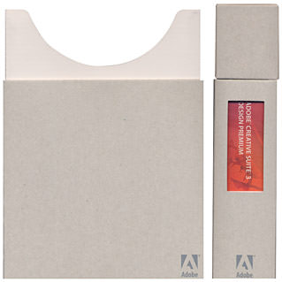
I've seen package design which nicely balances out wild-ass color with very plain elements for a nice artistic contrast, but this is just ridiculous. The box is badly constructed and boring. And the awkward attempt at adding a window of color on the side is lame (not to mention poorly implemented... obviously nobody made a folding model to make sure that the printed graphic would center in the window properly). In the end, I have no idea what Adobe is attempting to communicate with its new packaging, and cannot believe this is what they ended up with. Kind of sad, really. Oh well, at least it looks like they are using recyclable materials for the interior box which is nice.
The package comes with a tiny booklet to tell you about all the cool new things that CS3 can do. Overall, it does a pretty good job of doing so, even though it suffers from a number of design faux pas. Namely, for a piece that is meant to be read, the designer went to rather curious lengths to make sections unreadable...
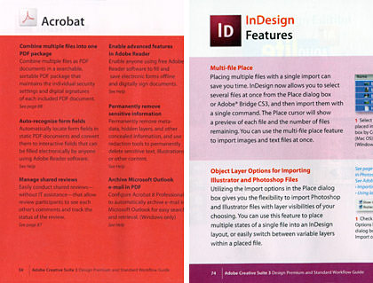
Sure it looks pretty to put black text on a blood-red background, but who can read that shit? Whenever designers do stupid crap like this, I want to slap them (or kill them... the designer for MorningStar Farms who puts IMPORTANT COOKING INSTRUCTIONS in teeny-tiny black text on top of dark green should be shot). The small booklet is overwhelmed with colors (and not in a good way) and certain sections are printed over colors that make your eyes bug out (purple and magenta?). Helpful hint to designers... if something is supposed to be read, MAKE IT FUCKING READABLE!!
Of course, software doesn't come with actual printed reference manuals anymore... but Adobe will sell you a set for fifty big ones. And what do you get for your $50? The complete and total opposite of too much color. No color at all. This is really special for those sections which are using black & white graphics to demonstrate COLOR functionality. Look at this "before & after" from Illustrator's "Live Color" section... can you see a difference?

But it gets worse. When you put the books on a shelf, YOU CAN'T TELL THEM APART WITHOUT READING THE TITLES!!

At first I thought Adobe was saving money by printing the covers in black & white too, but I looked at the front and saw that this wasn't the case...

WHAT THE BLOODY FUCK?!?
Yet ANOTHER huge example of somebody's artistic nature completely fucking over usability. Sure it's nice and artsy to have a tiny splash of color on a pretty white cover... but to what effect? NOTE TO ADOBE: PEOPLE DON'T FUCKING PUT THEIR BOOKS ON A SHELF WITH THE FACE TURNED OUT... THEY PUT THEM SO THE SIDE IS SHOWING!! If you're going to spend the money to put color on the book covers, why not put the shit where it will actually do some good. Like, oh, I don't know... ON THE SPINE WHERE PEOPLE CAN USE IT TO DISTINGUISH THEM?!? How fucking difficult would it have been to do THIS...

HOLY SHIT! YOU CAN ACTUALLY TELL THEM APART NOW!! On the Scale of Total Stupidity, this has got to be a nine... maybe a nine-and-a-half. Usually you have to invade a country with no plan and no exit strategy to reach this kind of dumbassery. I simply cannot comprehend it when designers do crazy-ass crap like this. It's fine to be artistic, because that's what makes things interesting, but not at the expense of usability, readability, functionality, or convenience. These are basic concepts that any graphic designer should understand. Did anybody even bother to put the books on a shelf to see how they read? I doubt it. If they did, then this would have to be a perfect 10 on the Scale of Total Stupidity.
But packaging and books aren't what's REALLY important. How does the actual product function?
Ever since I got my Intel-based Mac Pro and MacBook Pro, I've been suffering with constant... CONSTANT crashes in Adobe apps. Nothing is more frustrating that to be working on a project for an hour or two and lose everything because you forgot to save along the way. Well, these new CS3 apps are compiled to be "Universal" so they work on both PowerPC and Intel Macs equally well. Hooray!
At least that's what I thought.
Within minutes of starting up CS3 and playing around with Illustrator's incredibly cool new "Live Color" tool, which allows you to instantly adjust colors or apply color pallets on the fly to do nifty stuff like this...

I got this...

Well this certainly does not bode well. Assuming I'm not crashing all the time in CS3, perhaps I'll blog about all the other cool new stuff they've done with my favorite software later on...
UPDATE! For those of you who cannot get CS3 to install Photoshop over the PS beta that Adobe released... even after using the uninstall utility... they now have a swell "clean-up" script available to root out all those various beta pieces that are messing up your install. I'm posting the link here, because it's not like Adobe gives you any phone numbers to call for help with the CS3 package, and it was a real pain in the ass to search it out on Adobe's site.

I love comments! However, all comments are moderated, and won't appear until approved. Are you an abusive troll with nothing to contribute? Don't bother. Selling something? Don't bother. Spam linking? Don't bother.
PLEASE NOTE: My comment-spam protection requires JavaScript... if you have it turned off or are using a mobile device without JavaScript, commenting won't work. Sorry.
Quel professionalisme ! 🙂
Oh boy. I think I’ll stick with my CS versions for now.
I’ll stick with my older versions.
I dunno. Since I’ve been playing around with all the new toys in CS3… I’m doubting I could go back! The feature set is well, well worth the money to upgrade.
Even though I have crashed a couple of times now…
“Usually you have to invade a country with no plan and no exit strategy to reach this kind of dumbassery.”
Thank you. I now have a new favorite catch phrase!
This is all fine but will you please ask them (you’re closer) to stop ripping off their european customers by more than doubling the price tag?
I’m going to bring this up every time adobe is mentioned, just to warn you.
Oh crap… Thanks for the preview of what I’ll be going through when my copy of CS3 arrives in another week or so – ARGH!!!
Man, I’m still with CS. My design mentor says that CS2 is over-bloated, just CS with newer pallettes. The old CS palletes are fine. I wonder if someone could hack the cocoa script and get Live Color in CS.
Does one have to have CS2 to buy the upgrade to CS3? Or can they use a serial number from an older PS or CS1 to do the upgrade?
Wow, I thought I was the only person in the world that wanted to kill Morningstar Farms’ package designers. I completely agree with your assessment of “pretty text” versus “shit we can read text”. And yes, your versions of the boxes are much better, FFS.
You can totally tell this review was done by a designer ;). Thanks so much for all of the information; I’ve been thinking about making the switch so this helped a lot. Do you feel that your love for the tools will outweigh your non-love for the packaging?
Have fun playing!
I’m thinking Adobe owes YOU a fortune in consultation fees.
Wonderful colors on bad monkey!
Is explorer Dave turning into a green inconvenient truth or is he just getting envious?
Okay, well, I’ll stop complaining about upgrading to Photoshop CS2 the DAY before they announced the imminent release of CS3. Clearly, I should wait until the imminent release of CS4 to purchase CS3, with all the bugs removed. 🙂
I noticed this same “art before useability” B.S. when wrestling with the Adobe website to find out which bundle/pack/suite/collage/montage to order. I gave up and eventually stumbled on some Flash-crappy grid – but could never tell you how I got there!
Can’t tell you how many times I’ve seen this before! No one with any common sense takes a final look at things.
I commented on that to the customer service guy when I had a problem with one of the serial numbers: “You know the fonts on these stickers are impossible to read – 6’s, 8’s, and 9’s all look alike – isn’t Adobe *THE* type font specialists?!?” He laughed, somewhat nervously.
Am looking forward to my CS3 upgrade (I plan on it being the last time I upgrade) – perhaps it’ll be in the mail tomorrow? I usually toss the manuals (never used them – always used books or on-line resources *OTHER* than Adobe), but hilarious that they’re all impossible to read and look the same…
*** DUH!! ***
Makes one wonder… 😉
Jeff… So does our government. 🙂
MRK… Yeah, but when you consider that the US$ is worth HALF of what the UK pound is at… you are getting it cheaper!
Turtle… Actually, I thought that CS2 was a very worthwhile upgrade from CS. And I’d think it would be quite impossible to “hack” Live Color into an older version, because it looks like the entire color engine had to be overhauled to use it?
Kyle… I think you can upgrade from CS… but the cost is higher than if you upgrade from CS2.
Hilly… Oh heavens yes. It’s a little crash-prone for me, but the new features of CS3 are totally worth it!
Geeky Tai Tai… A pity it’s too late to do anything about it. 🙁
Bogup… He ate salt pork.
James… I dunno. CS3 is pretty compelling. The feature set is one of the best in the product(s) history.
Kapha… I’m sure CS4 will change your mind. 🙂
There’s a reason why I don’t upgrade very often. When I find a program that works well for me, I stick with it. I use the Adobe Design Suite too, and I love it. The same versions I’ve used for the past 5 years. You do more graphics, you probably have to upgrade. But it’s painful.
Oh, and about the documentation. I know the director of documentation at Adobe. Um… yeah. I used to work with her at another Silly Valley company. She’s really nice. Honest. The department is FUCKED, tho. Big big egos working there in the heart of the San Jose flight path. The have NEVER cared one iota about book design (my specialty) nor do they care much about packaging. And the doc dept… you have to remember that they use their own product to produce the documentation. Now I’m a FrameMaker guru. I’ve been using it since Frame Technology invented it back in the mid-80’s. I’m one of the very first users. I still use it all the time. BUT… it’s not a design product. It’s a documentation product. It’s specifically made for producing technical documentation. Printed doc. That is WAY too expensive for color. Those books would be more than college text books if they used color. So they provide PDF files for you to see what you want in color, and to print out if you need the color. Most people don’t even want the hard copy anymore. They are so not cost effective. Which is why they’re only in B&W and don’t come with the product.
You DO know what I used to do, right?
Actually MRK has a point Dave:
US price for master edition:US$2,499
UK price: £2,313 (which is about US$4,626)
Not quite twice as much, but significantly more.
And not just Adobe. Most pieces of software are like this
Neal
Margalit… Actually, the documentation for Adobe products is not so bad (though it isn’t indexed as thoroughly as it should be). It adequately describes features and explains how to use them, which is all I need. However, Adobe used to insert color plates in their manuals for those sections which demanded it… like color correction and color tools. This saved the expense of doing the entire book in color, yet provided it where really needed. But now we don’t even get that (except in PDF, as you note). Overall though, my beef is with the cover design, which is less than useless. Oh well. Adobe bought out FrameMaker, do they even sell it anymore? I’ve used it for exactly two projects, and found it to be excellent for lengthy publications, though that was years ago, and I’m hardly an expert. 🙂
Neal… There’s no question that the products cost more in the UK… but you kind of have to take a look at the costs relative to what the dollar/pound can actually buy in their respective countries. Given the near-worthless value of the dollar in international arena, Adobe appears to be pricing appropriate to the market… though a bit on the high end, I agree. MS Office is at a conversion ratio of 1.6 … Adobe CS3 is at 1.85 … If Adobe were to be at a comparative price ratio to Microsoft, it would be selling at £1,846 in the UK. Hmmm… on the strength of the pound sterling, I say fly to New York and buy your copy! You may end up spending £2,313 once airfare has been added in, but at least you’d get a quick holiday out of the deal! 🙂
Just ordered my CS3 Design Premium yesterday. I was going to do the upgrade, but ended up going the Educational version route (my 15 yr old daughter has been having me help with several school projects and Photoshop and Apple Pages have been godsends).
The price of the Educational version vs. the upgrade price was a difference of under $100, but after reading your post about the upgrade, plus the advantage of getting the whole product (even if it is marked Education) won me over.
So far, CS2 hasn’t been all that bad on my MacBook Pro (Core Duo, 2gb RAM, 100gb hdd) with only a crash or two over the last year that I’ve had it. I’m hoping CS3 will be a lot faster loading and working.
I’m with Avi, I’ll stick with CS2 on the Lappy. But it’s all GIMP on the Linux compy.
On the topic of icons, Adam Betts has made a nice set of new icons for the CS3 apps.
🙂
ChillyWilly… Very wise. The upgrade is a total pain in the ass. I can’t wait until I get a new computer or reformat and start over so I can do this all over again!
The Chad… GIMP isn’t a slouch when it comes to graphics, and is getting better all the time. I still use it on occasion.
Brad… Pretty!
Some badass comments. Well observed.