


 This morning I got a phone call from a fellow designer who wanted advice on how to best run a straight pattern around the edge of a circle. There are many ways to approach this challenge, but I told her my favorite way is to dice the design into pieces and turn the pieces into a font. Then you simply type the pieces around a circle. It's a lot of work, but it gives you the most flexibility.
After thanking me for the help, the conversation took a curious turn...
Samantha: So what are you going to do for CSS Reboot this year?
Dave: Uhhh... what's that?
Sam: It's a redesign for you web site using web standards.
Dave: Ah, well my blog is already standards-based.
Sammy: Yeah, but you've had the same design forever. Don't you want to try something new?
Dave: Not really.
Sam-O: Well that's disappointing.
And I suppose that deep down it's disappointing to me too. With the exception of adding rotating cartoon headers, changing the background to black, and adding tabs... the design for Blogography is pretty much the same as it's always been...
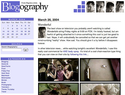
But here's the problem... I like it exactly how it is now. It's clean, simple, and allows the content to have prominence. About the only thing I would change would be to add "MaxWidth" to prevent everything from getting too spread out on really wide displays. But Internet Explorer doesn't handle it properly, so I guess there's nothing to be done.
So, to everybody who is bored with my design, I'm sorry to report that I won't be changing it any time soon.
Doesn't everybody read their blogs via web feed anyway?

I love comments! However, all comments are moderated, and won't appear until approved. Are you an abusive troll with nothing to contribute? Don't bother. Selling something? Don't bother. Spam linking? Don't bother.
PLEASE NOTE: My comment-spam protection requires JavaScript... if you have it turned off or are using a mobile device without JavaScript, commenting won't work. Sorry.
I haven’t taken the time to figure out blogfeed yet.
However, I like your design. It’s easy to navigate around, and the little cartoon Dave’s everywhere make it entertaining.
Better than my pink monstrosity that I haven’t had the inclination to change.
My RSS feed usually tells me when people have updated… but as you know, you are the exception to that rule LOL. My basic though is “If it ain’t broke, don’t fix it.” I change mine around far too often, but that’s mostly because I’m not creative enough to come up with something original that I actually like.
Your design is like Apple’s OS. You add just the right things at just the right time to keep it great. I would be disappointed to see it change completely.
I really like your blog design. To me, few things are more frustrating than when a good design is changed only to do something new rather than to achieve a specific goal.
I dig your design. And I would hire you to design mine if your pricetag wasn’t up to $1million. If you’d reconsider that, I’d fork over the dough in a heartbeat.
I use my RSS aggregator just to tell me what sites have been updated. I pretty much always click through to read the posts because I live for seeing the familiar design of sites. Not to say that a little occasional “spiffing up” is a bad thing. I’ve done it on my own site. But a complete overhaul when you’ve got a site as nice looking as yours is, Dave, is just not necessary. You’ve got a unique design that no one else has. If you had a Blogger or Typepad template like most of the rest of us, then an occasional overhaul isn’t a bad thing.
Stick with it, man. We all love it.
I’ve only recently started using feeds (during the Lost Blogs week, actually, to keep up with 40 blogs a day!). Most blogs I do read in Bloglines, but any time I want to leave a comment – which is frequently – I have to go to the original web post, anyway.
Love your site. Like you said, it’s clean and simple. For me, it is so easy on my eyes…I mean, visually, it’s easy to read. Black text on white background. That’s what got me thinking about swapping my color scheme out. Glad I did.
I still love your blog design, and I’ve been looking at it for several months now. If I had to pick 1 blog that I wished I’d designed, yours would probably be it.
Did you watch VM last night? I totally thought of you while I was muttering to myself, omg, I didn’t see that coming.
Change is bad. Just ask Christine Jorgensen.
Dude, I love your site. I’m looking for a remodeler for mine.
Karl, you forgot to add “W00T!” Just lookin’ out for you, dude.
I read your blog the old fashioned way, with a Firefox live bookmarks twist.
For what it’s worth, I really like the look of your blog. Don’t change a thing!
In my humble opinion i like your site…and i think you said something about all the cartoons being up in one spot and i am looking forward to that also….
You kind of lost me alittle here. Could you please elaborate alittle on “dice the design into pieces and turn the pieces into a font”?
You´re design is a classic with a personal twist. no need for a redesign just for the sake of redesigning.
Chase – I’m gonna put you over my knee!
Why mess with perfection…. good for you for sticking to your guns.
I’ve become shockingly conservative with my site design as well… also like it as it is now. In addition _if_ I were to do a new design that’d have to be all new, better looking and with less clutter. Which’d mean that I’d have to reassemble _all_ the Movable Type templates and all that would be a rather labour intensive task to get all the things right again which have been carefully elaborated and fixed in the current design over years.
Ugh, and of course everybody’s using RSS (which is why you shouldn’t do those ‘extended’ entries, they’re very inconvenient. Yet I like visiting your site for real because of the happy green Irish Dave I get to see after hitting the Post button.
Not me, Dave. I come straight here since I have you linked and you start with a “B” so you’re at the top. I love seeing this design and clean and simple is my favorite. Changing banners is preferable to changing the entire design.
Leave it alone. 😉
Your site design is fine – don’t bother changing it unless you really want to 🙂 .
I’m probably going to change mine soon but then that’s partly because I’m not 100% happy with it.
Thanks everybody for the kind comments. I was preparing myself for a chorus of “YES, YOUR BLOG IS STALE… CHANGE IT NOW!!!” That would have been kind of sad, but understandable.
Oddly enough, I HAVE considered changing the cartoon you get when you leave a comment (sorry Sven!)… thinking perhaps it would encourage people to comment more often if they knew they would get new cartoons from time to time. Between that and changing out the banner toons… well, that might be as close as I get to a reboot for a while. 🙂
The only thing better would be if you could design a cool page that would, say, rotate through your readers’ profiles in a kind of super-unique peronalized Dave-tacular blogroll!
Or you could just tease us with the idea 😉
I like it the way it is.
And the shamrock graphic is my fav, BTW. 🙂
You know, I do read it in my RSS reader first… but then I inevitably want to comment and here I am again.
Oo – here comes shamrock Dave… 🙂
I like your design just the way it is! And as for the RSS question, I used to read all my blogs that way but started to get stressed out about it (it felt like another inbox I’d never get through) so I disabled it last week. Well, except for work-related blogs. But I might go back…I miss it.
Hmmm, I do not know what “web feed” is… am I living in the 80s or something?
I think if you like your desing you should stick with it! The only reason I change mine is because I personally get bored with it!
I like yours the way it is! 😉
If you changed your site I’d…I’d…well lets hope we never have to find out! The clean cut simplicity is a comfort.
Dave2, you’ll be pleased to know that the design of your blog has been trendsetting. According to Web Design From Scratch, the best-looking websites currently have these characteristics in common:
Simple layout
3D effects, used sparingly
Soft, neutral background colours
Strong colour, used sparingly
Cute icons, used sparingly
Plenty of whitespace
Nice big text
When I first read that article, I immediately thought of Blogography. Then I thought about changing CL’s design to incorporate those elements. But … no. If it didn’t look like lists jotted on a yellow legal pad with a Pilot FinePoint, it wouldn’t be Chronic Listaholic. But lucky you — your blogsite already has the look everyone else wants!
Stay as clean, crisp and trendsetting as you are; don’t change a thing.
(Why do I feel like I should now write, “Have a great summer — see ya in September!”?)
I read the post in Bloglines and then inevitably come over to comment or just to stare with total jealousy at the smoothness of this page. I have been fighting with my layout for a while now…
(Mind you I read CSS style books and cry with confusion!)
I stole parts of my original design from yours, just the way it is.
Really, I still can’t think of any layout that’s more functional than yours which is a drag when I’m trying to come up with a “new look.”
DO NOT change a thing about your design. I love the design, I’ve finally gotten it down so I can find everything I want to find quickly without any frustration whatsoever. I think you have one of the best designs on the whole blog-net.
I like your site design too. And I’m comfortable with it, too. When I come here, I know where I am. I’m at the Blogography! Since you post your cartoons in many of your entries, it gives the readers something nice to look at.
I have feeds for stuff, but I never look at it.
I like your design just as it is… No need to change; it makes your blog very easy to read and navigate…
I have a friend who changes her blog design and name fairly regularly. I’ve know her for almost 10 month, and she’s changed them both at least three times. It works for her, but it is a little disorienting for her readers each time she does it, and I have to go into my template and change her link name. Oh well. What ever works.
I think change can be good. Although in your case Dave, what you have really works and I wouldn’t change your design at all.
I change my blog design a lot because I am never satisfied with it. If I had designed it myself instead of constantly tweaking templates I think I would be more satisfied.
Wait– I wanna know– would it work to make a custom brush of the pattern in Photoshop, then in Illustrator use it to stroke the selection? I’m asking because, well, you’d know. For my edification. Important stuff, my edificatwhatever…
i dont really believe in “don’t fix it if it ain’t broken” because i think more often than not, you can improve on something. And if you don’t and everyone else is, then not changing is in effect “retrogressing”.
but i have to say… nooooo… don’t change it! i love your current design. nice, clean, simple, easy to read. the only improvement i could suggest is…
MORE DAVETOONS!!!
The blog is perfect. Leave the blog alone. Seriously. Step away from the blog and nobody will get hurt.
I have not yet figured out how to read blogs via RSS feed — and probably won’t for a while, as I do not read that many blogs (yet).
i don’t read via feed. i like to get a feel of the person from the template layout and such. i’m old fashioned i guess. i like hand-written cards too.
your design is great! why change a good thing? at least you aren’t personally stagnant, right?
🙂 sizz
Oh no… don’t remove the Dave-rachaun! He makes me feel like a bowl of lucky charms every time I comment. You don’t want to take that away from me, do you??